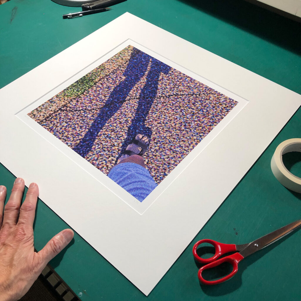
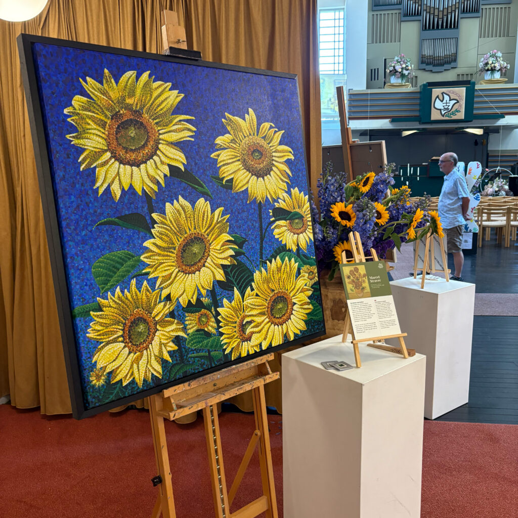
My first lithography
In 2023, I was commissioned by the Dutch Museum of Lithography in Valkenswaard to create a full-colour lithograph to mark the exhibition ‘PUNT. Pointillism. Pop Art. Pixel’. The exhibition centred on the importance of the dot in art, particularly the rise of chromolithography, which made multi-colour printing easier and more affordable in the mid-19th century. From that moment on, European streets were filled with colourful advertising posters, often created by artists and printed using lithography. So it’s hardly surprising that the museum approached a modern pointillist to create a multicolour lithograph. It was a great honour, and right up my street. Except… I’d never done this before!
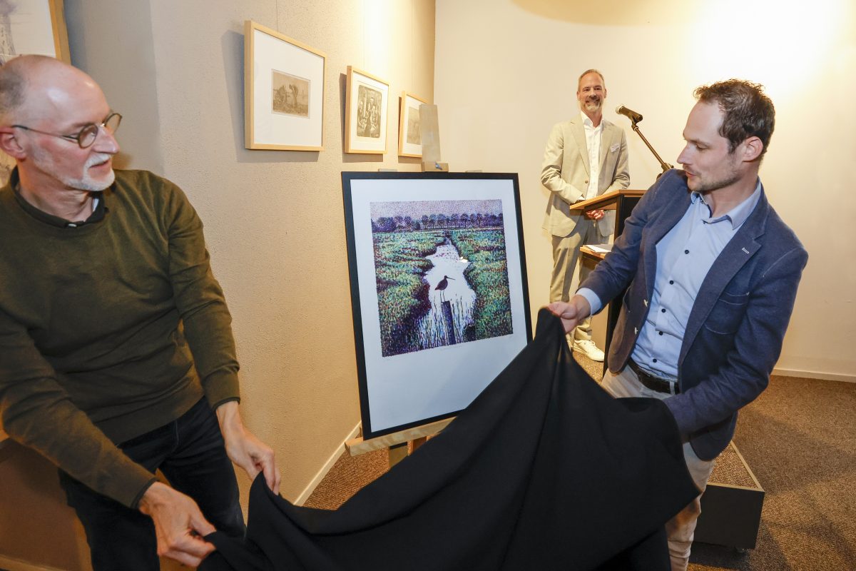
I created that first lithograph in close collaboration with the museum, drawing inspiration from a photograph I took myself of a black-tailed godwit in the polder where I live. The lithograph ‘Glorious Godwit’ is on sale at the museum. You can find more information about it in the PRINTS section of my website, and you’ll be redirected to the museum’s website if you click the ‘Order’ button. The photo shows the unveiling of the lithograph by the alderman of Valkenswaard at the opening of the exhibition in 2023.
Lithography is plane printing
To produce a multi-colour lithograph, you need to paint several lithographic stones with a greasy black ink, known as ‘tusche’. Printing with lithographic stones is a specialised task. The stones are extremely thick and almost impossible to lift. The printing process is planographic and is based on the principle that water and grease repel each other. There is therefore no raised or recessed area in a particular image; instead, the image and the non-image areas lie on the same plane. That plane is the polished and ground surface of the lithographic stone. By painting onto this surface with black India ink and then treating it with a mixture of gum arabic and nitric acid, the image becomes oil-loving (oleophilic) and will accept the printing ink during the printing process. The areas that are not part of the image, on the other hand, become water-loving (hydrophilic) as a result of this treatment and will repel oil.
Temporary studio
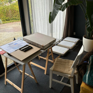
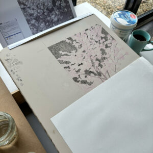
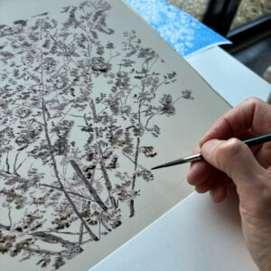
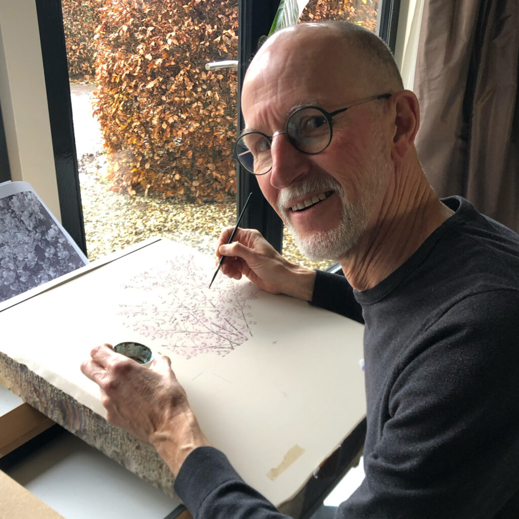
With a multi-colour lithograph, you, as an artist, must therefore paint several stones in such a way that, when printed together, a complete full-colour image is created. Just as with my first lithograph, the museum arranged for the necessary, pre-prepared lithographic stones to be delivered to my home for this second one too. I now have my studio on a mezzanine in the living room, but I wasn’t keen on lugging those heavy stones upstairs. So I set up a temporary studio in the living room. Two trestles with a sturdy top, a few slats underneath, and then lifting the first stone onto it. And then you’re ready to get started. First the stone for cyan, then the stone for magenta, then for yellow and, finally, the stone for black.
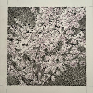
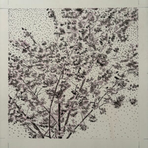
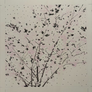
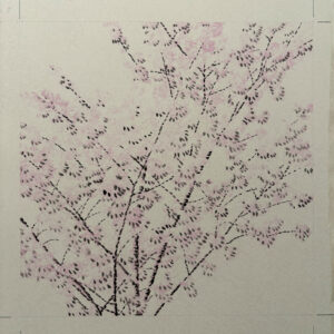
It sounds simple, but when printing, everything has to line up more or less exactly, of course. In the printing world, this is known as ‘register’. That is why all four blocks are pre-printed with a stencil of the desired image to serve as a guide when painting. But then there is also the fact that, for example, one area needs more cyan, whilst another needs more magenta or yellow. After all, the combinations of these colours create other colours, such as green (yellow and cyan) or orange (magenta and yellow). Black is mainly used to add extra contrast and shading. So it falls to me to translate the image onto each stone, colour by colour, into larger and smaller dots, and more or fewer of them, to create the final desired image. Below, in sequence, are the stones painted for cyan, magenta, yellow and black (CMYK).
The process
When creating a lithograph like this, your graphic design training comes in particularly handy. It helps you to analyse your reference photograph effectively in terms of colour separation into the printing colours cyan, magenta, yellow and black. You break down the photograph, as it were, and then translate it onto each stone as an image suitable for the relevant printing colour. The exciting part, of course, is seeing how it will turn out in the final print. Now, in lithography, this is always subject to a degree of chance, as it is a much less controllable printing process than, for example, a modern offset printing press (which, incidentally, is a modern variant of planographic printing). But that element of surprise is precisely one of the appealing aspects of lithography as an artistic medium.
To retain at least a little control – because it’s not really possible to make corrections – I took a photo of the stone from directly above whenever I thought it looked right, or whenever I wondered whether I’d made it too heavy. I then converted this black-and-white image on the computer to the relevant colour and combined it with the other colours to create a simulation of the combination print. This gives a good indication of the end result and allows you to make any necessary adjustments. However, you can’t remove anything; you can really only add dots or dashes. Incidentally, to avoid putting too much pressure on myself, I dotted the lithograph in a slightly ‘freestyle’ manner. Below is a video of the cyan colour being printed.
Limited edition
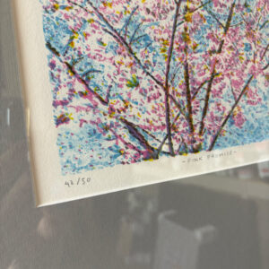
The lithograph was printed in full colour by museum printer Rolf Maas in an exclusive edition of 50 copies. 40 copies are being issued by the museum. I am selling the remaining 10 copies myself. I am offering them as fully framed works of art: the lithograph print including a grey passe-partout, float glass and a black frame. These lithographs are numbered (41/50 – 50/50), signed and feature the museum’s embossed seal, along with a Certificate of Authenticity. For more information and to order the ‘Pink Promise’ lithograph, please visit my PRINTS webshop or contact me.

 Process, Specials